


Turn categories into a visual split
Paste budget lines, survey counts, channel mix, or ticket categories and let AI draft a chart-ready breakdown.
Turn proportions, category shares, budgets, survey results, and allocation data into a clean doughnut chart for slides.
Drag & drop your file here or
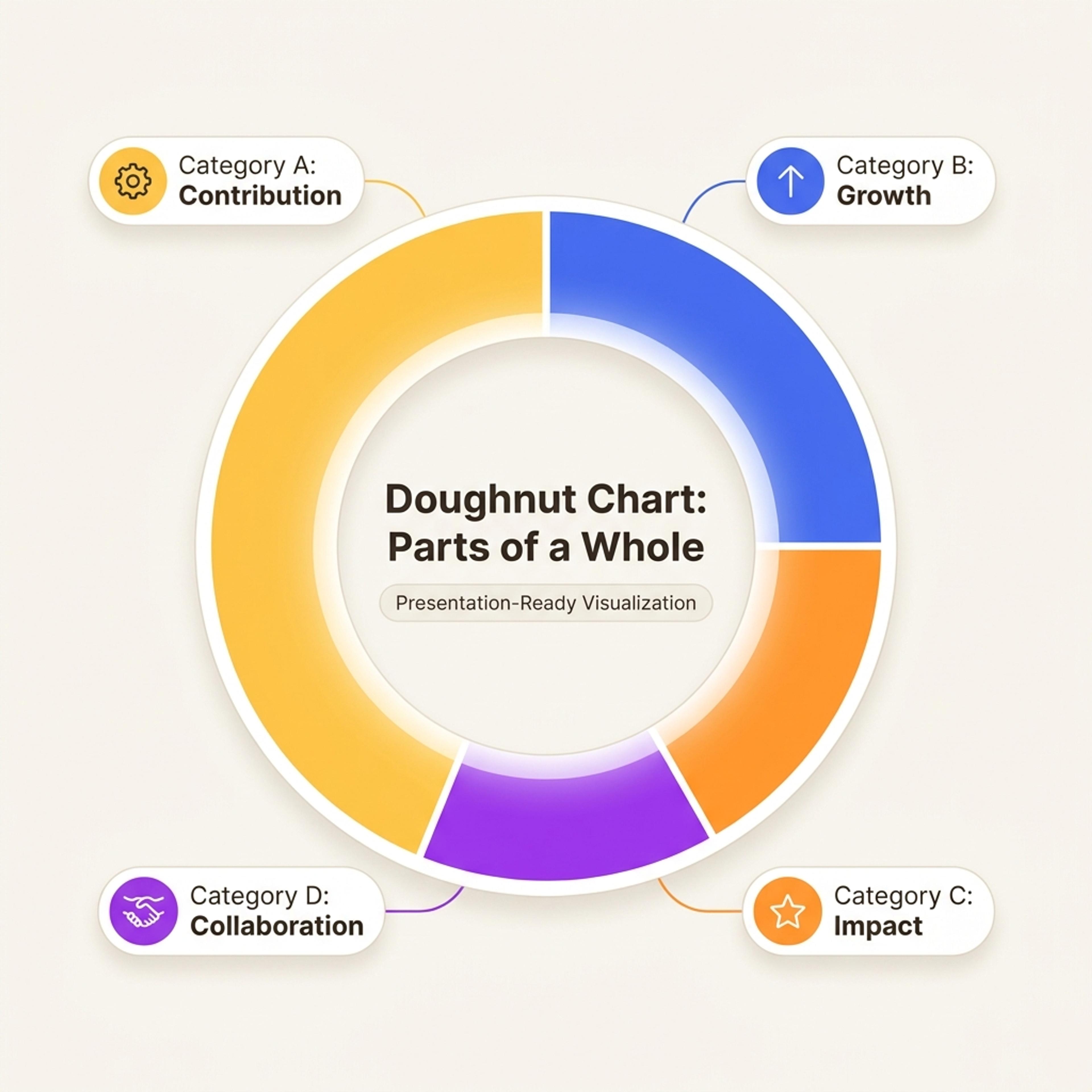
A doughnut chart shows how a whole breaks into parts, making it useful for allocations, proportions, survey answers, and mix analysis.
Use this format when the audience needs to see how categories contribute to a total.
Paste budget lines, survey counts, channel mix, or ticket categories and let AI draft a chart-ready breakdown.
Help the audience quickly see which categories dominate, which are small, and where the mix may be unbalanced.
Bring the chart into budget reviews, campaign reports, research presentations, operations updates, or nonprofit summaries.
Provide the categories and values, then check the chart before it goes into your deck.
Paste the categories and numbers you want to compare, or describe the proportion data in plain language.
Tell AI what the chart is for so labels, grouping, and explanation fit the audience.
Verify the values, simplify category names, and make sure the chart adds up before presenting it.
Use doughnut charts when proportions, mix, allocation, or segment contribution needs to be clear quickly.
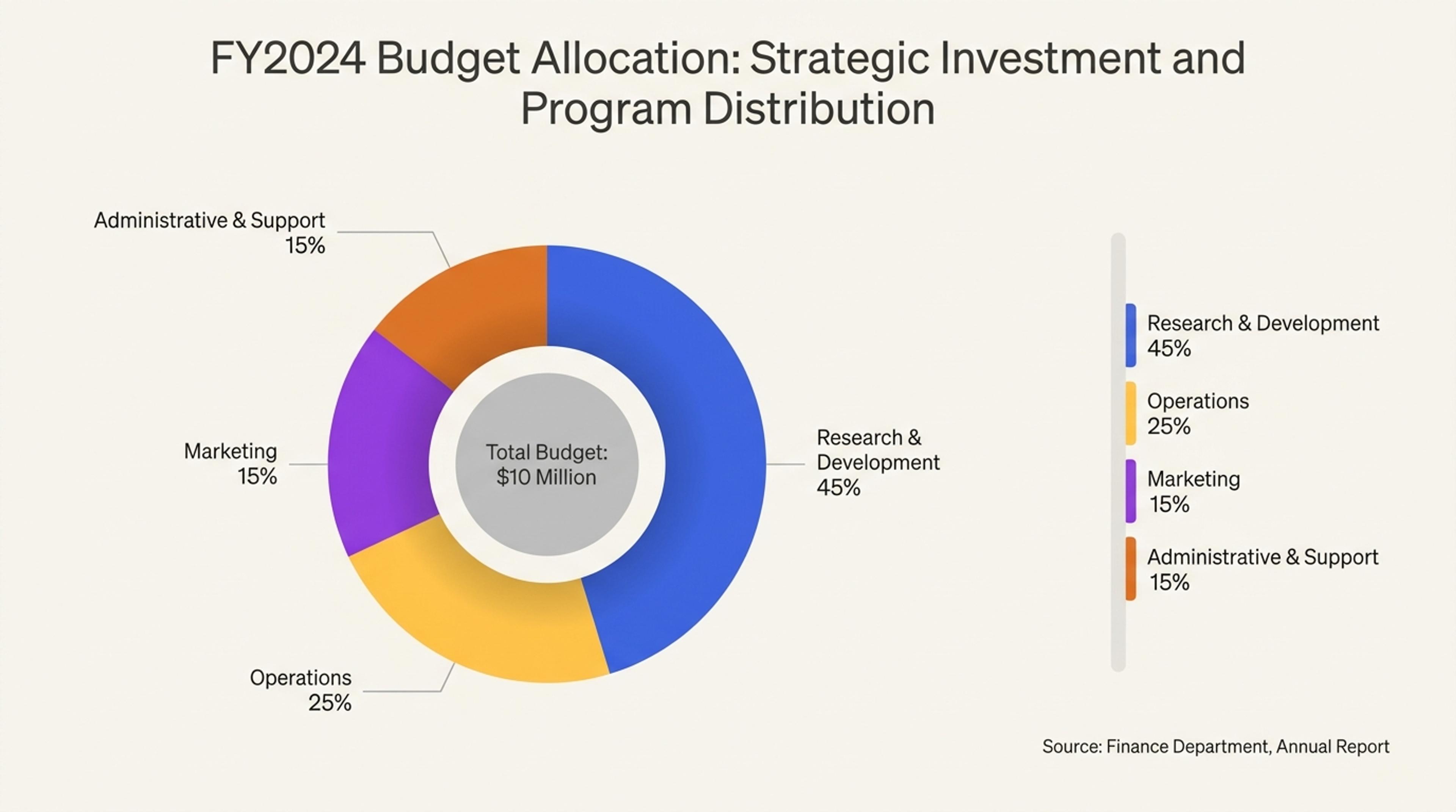
A board-ready doughnut chart showing how budget is distributed across programs, teams, or initiatives.
Use categories that add up to a meaningful whole, such as budget allocation, survey response share, issue types, or channel mix.
Yes. Paste category names and values, then review the generated chart to make sure the totals and labels are correct.
Avoid it when you need precise comparison across many categories. A bar chart is often clearer if the values are close together.
Yes. You should verify and adjust any numbers before presenting, especially if the chart is used for business or research decisions.
Yes. Doughnut charts work well in executive summaries, campaign reports, finance decks, and survey readouts when the split is the main point.
Use these formats when proportions need context, prioritization, or a stronger explanation.
Turn topics, notes, documents, and links into editable visuals for slide decks, lessons, reports, and planning conversations.
Organize strengths, weaknesses, opportunities, and threats into a clear strategic planning slide.
Structure political, economic, social, technological, legal, and environmental factors into a strategic planning slide.
Visualize conversion stages, selection processes, sales pipelines, recruiting steps, and drop-off points in a funnel chart.
Show hierarchy, foundations, priority levels, maturity stages, and strategic layers in a pyramid chart.
Organize scattered notes, research themes, brainstorms, and lesson topics into a clear editable mind map.
Paste category data or describe the split you need to show, then turn it into an editable slide visual.