

How to Present a Research Paper: Slide Structure, Examples, and Checklist
A practical guide to turning a research paper into a focused presentation with the right evidence, slide sequence, and level of detail.
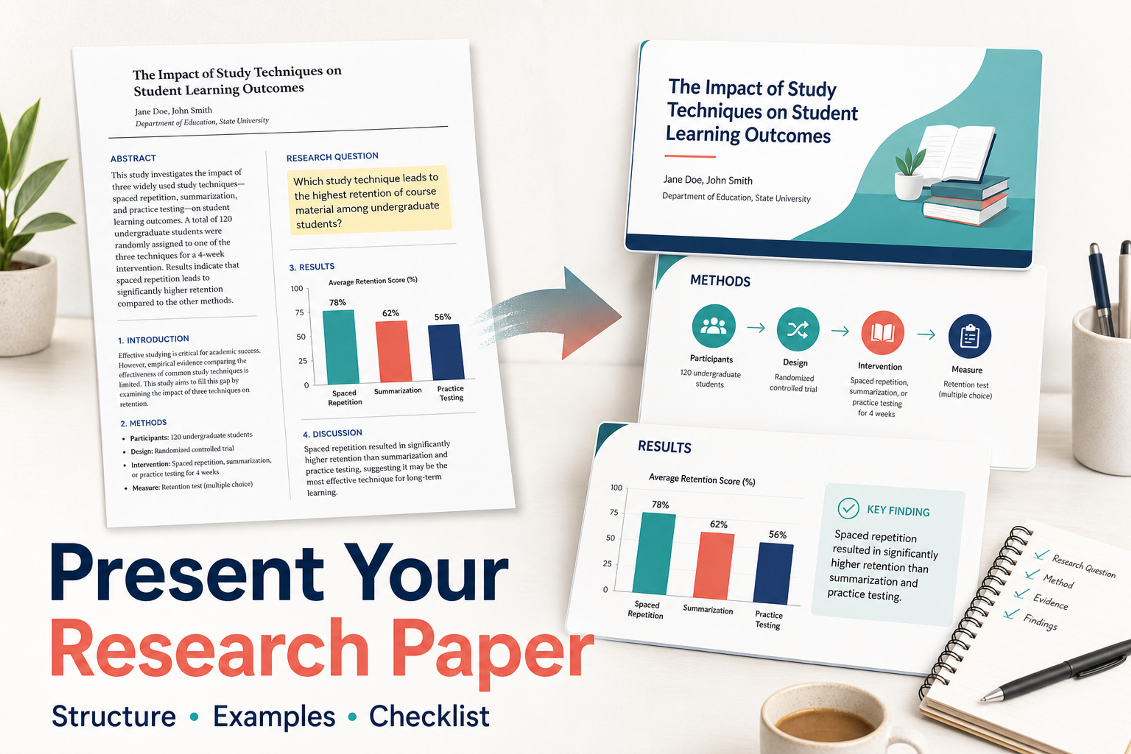
A practical guide to turning a research paper into a focused presentation with the right evidence, slide sequence, and level of detail.
A strong research paper presentation is not a paper copied onto slides. It is a shorter argument built for an audience that needs to understand the research question, trust the evidence, and remember the conclusion.
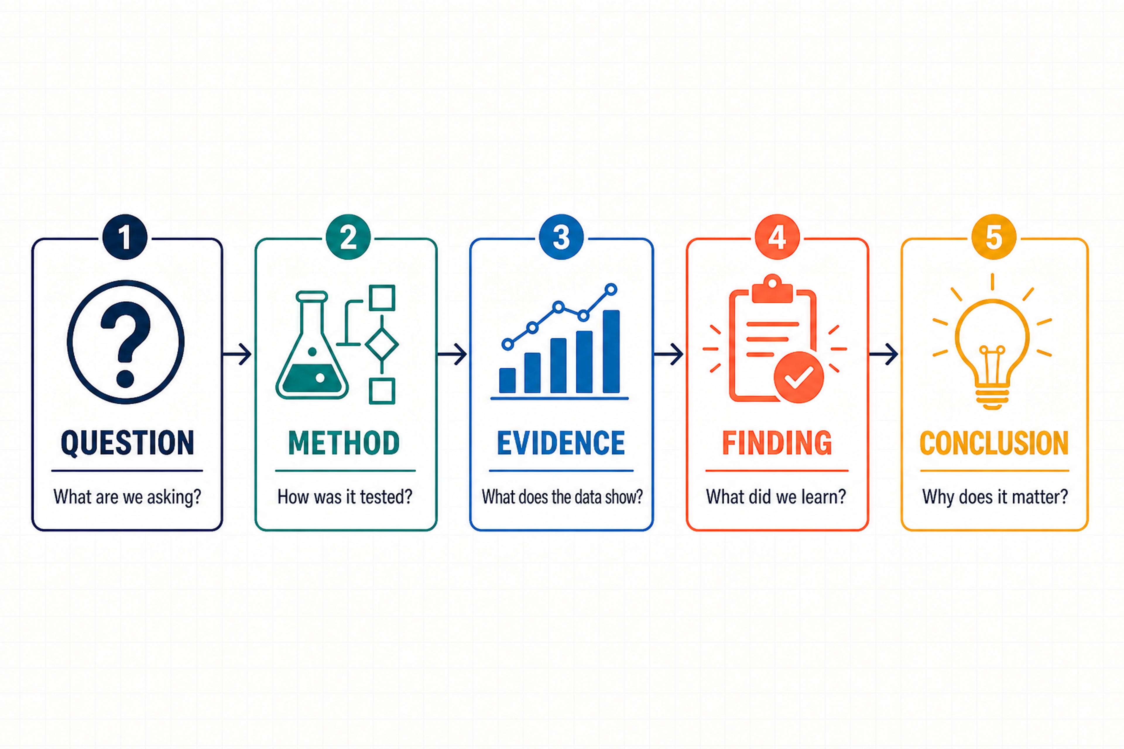
The most reliable structure is: question, context, method, evidence, findings, meaning, and next step. Use that sequence to decide what to keep, what to visualize, and what belongs in speaker notes or an appendix.
If you are starting with a PDF, you can also use the PDF to PowerPoint workflow to create an editable first draft, then apply the selection rules below to shape the final talk.
Before building slides, define three things:
Those answers change what belongs on each slide. A specialist audience may need sharper methods and statistical context. A general audience needs more background and fewer unexplained terms. A decision-making audience needs implications earlier and technical detail later. The same paper can produce different presentations because the audience changes the emphasis.
For most research talks, the goal is not to prove you read the whole paper. The goal is to make the paper's contribution easy to understand and discuss.
A paper’s sections are useful source material, but they should not become a rigid slide-by-slide copy. Translate each section into the audience question it answers.
| Paper section | Audience question | Slide message | Evidence to keep | Best visual form |
|---|---|---|---|---|
| Title and abstract | What is this about? | The paper answers one important research question. | Research question, context, main contribution | Title slide with one-line takeaway |
| Introduction | Why does the problem matter? | Existing work leaves a gap worth studying. | Problem, stakes, prior limitation | Problem framing diagram |
| Literature review | What do we already know? | The study builds on a specific research conversation. | 2-4 core sources or themes | Concept map or short comparison table |
| Methods | How was the evidence produced? | The design is appropriate for the question. | Data, sample, variables, procedure, model | Process flow or study design graphic |
| Results | What did the paper find? | The main finding changes how we understand the problem. | Key numbers, relationships, charts, examples | Clean chart, table excerpt, or callout |
| Discussion | What does it mean? | The result has a clear implication and boundary. | Interpretation, mechanism, limitations | Claim-evidence-implication layout |
| Conclusion | What should we remember? | The paper contributes one useful answer and opens a next question. | Main takeaway, future work | Summary slide or decision slide |
This map prevents a common problem: giving equal visual weight to every paragraph in the paper. A presentation should give more space to the question, the evidence that answers it, and the implication that follows.
A useful deck can be short and still feel complete. Adjust the number of slides to the time available, but keep the argument in this order.
Include the paper title, authors, affiliation, and a plain-language statement of the contribution. Do not make the audience wait until the final slide to discover why the study matters.
Explain the real question behind the topic. Use only the background needed to understand the gap. Replace a long literature review with a focused progression: what is known, what remains unclear, and why the uncertainty matters.
State the gap and research question in language the audience can repeat. If there is a hypothesis, show it here or on the next slide. This is also the point to define a term if the rest of the presentation depends on it.
Show how the study answers the question. Include the population or dataset, key variables, procedure, and analysis approach when they affect interpretation. A process diagram is often clearer than a paragraph of method text.
Give the most important result its own slide. Use a single chart or comparison when possible. The slide title should state the takeaway, such as The intervention improved recall after one week, rather than a vague label such as Results.
Add one or two slides for the evidence needed to support the main finding. Explain what the audience should notice before showing a complex chart. If a table contains many values, highlight only the comparison that changes the conclusion and move the full table to an appendix.
Answer the question posed at the beginning. Distinguish between what the data directly show and what the authors infer from it. Connect the finding back to the literature gap without repeating the entire discussion section.
Include limitations that materially affect how the result should be understood. Pair each important limitation with a concrete next step, such as a new population, longer follow-up, different measure, or replication.
End with two or three statements: the question, the main finding, and the contribution or implication. Add a short prompt for discussion if the setting calls for it.
This structure works because every slide has a distinct job. The audience can see the path from question to evidence to meaning instead of trying to reconstruct it from dense text.
Upload it to SlidesPilot and turn the question, method, evidence and findings into a structured, editable PowerPoint.
Turn My Research Into SlidesUse these four tests when a paper gives you more material than the deck can hold.
A helpful editing rule is one message per slide. That does not mean one sentence per slide; it means the title, evidence, and supporting text should work together to answer one audience question.
Research results are persuasive when the audience can see what comparison matters. Before placing a chart on a slide, decide:
Use a sentence-style title to make the intended reading clear. Add a short annotation near the relevant bar, point, or segment instead of explaining every value in a paragraph. Preserve units, labels, and enough context for the chart to remain trustworthy.
For tables, show only the rows and columns needed for the point. For statistical results, include the measures that support the claim being made, but avoid turning a slide into a full output screen. Put technical detail in notes or an appendix when the audience may need it during questions.
Imagine a study asking whether spaced retrieval practice improves vocabulary retention among university students. A paper-style slide might contain the full research question, participant description, intervention schedule, test design, four outcome measures, and a paragraph of interpretation. It is accurate, but the audience has to find the main message.
A presentation-ready version could use this sequence:
The difference is not that the second version removes rigor. It makes the logic visible. The method includes the details needed to understand the comparison, the result shows the evidence that answers the question, and the interpretation stays within the finding.
When you have a long PDF or Word manuscript, work in two passes.
First, create a source outline with the paper’s question, gap, method, strongest findings, limitations, and conclusion. Mark the evidence that must appear in the main story.
Second, convert that outline into slide messages. Each message should have a claim, one supporting detail, and a visual form. This separation keeps source extraction from dictating the final presentation structure.
SlidesPilot can turn a PDF or Word document into a structured, editable presentation draft. You can choose a presentation style, adjust the length and tone, and refine the resulting slides in the editor. For a research paper, use the generated deck as the starting structure, then sharpen the research question, simplify the method explanation, and give the key finding enough space. The dedicated research papers to PowerPoint workflow is the closest path for this job. Princeton’s research-presentation guide recommends focusing on “a single compelling research question” and building a “succinct but complete narrative around it.”
Read through the deck once as an audience member and once as the researcher. Confirm that:
The best research paper presentations do not try to display the whole paper. They guide the audience through the smallest complete argument: here is the question, here is how it was tested, here is what the evidence shows, and here is why it matters.
Not every important detail belongs in the main sequence. Keep the presentation’s core story concise, then prepare backup material for questions. Useful appendix slides include the full study timeline, measurement definitions, additional subgroup results, complete statistical tables, or a detailed reference list.
Speaker notes can hold transitions, definitions you may need to say aloud, and the explanation behind a visual. They should support delivery rather than become a second paper. If a detail is essential for understanding the conclusion, it belongs on the slide or in the spoken explanation, not only in hidden notes.
A research presentation often opens with a broad problem and ends with a narrow result. Reverse that imbalance by making the conclusion specific. State what the study contributes, what the evidence supports, and what remains open.
A useful closing pattern is:
We asked ___. We found ___. This matters because ___. The next test is ___.
That closing gives the audience a complete answer without repeating every preceding slide. It also creates a natural transition into questions or discussion.
Use the time limit and the argument’s complexity to decide. Start by giving the question, method, main finding, interpretation, and conclusion enough room to remain clear. Add background and supporting results only when they help the audience evaluate the study. A shorter, coherent deck is more useful than a crowded deck that reproduces the paper.
Include the paper title, authors, affiliation, and a one-sentence statement of the study’s contribution. The audience should understand the topic and why it matters before you move into background.
Include the part of the literature review that establishes the gap your study addresses. A synthesis or visual relationship among a few key ideas is usually more useful than a long list of sources. Keep the full reference detail in a readable reference slide or appendix.
Show the method as a sequence: who or what was studied, what happened, what was measured, and how the evidence was analyzed. Use a diagram or timeline when the order matters. Explain technical choices that affect the result and move secondary details to backup slides.
Yes. SlidesPilot can analyze a source document, identify key ideas, organize them into a presentation, and produce editable slides that you can review and refine. The strongest result comes from giving the generated structure a clear audience, focused question, and evidence-first editing pass.
Presenting a research paper well means transforming the source, not shrinking it. Start with one question, map each paper section to an audience need, build a sequence from method to evidence to meaning, and reserve detail for notes or an appendix. Then use the checklist to make sure every slide supports the argument.
For a faster starting point, create your research presentation in SlidesPilot and shape the editable draft around the story your audience needs to remember.
Turn a research paper into a clear, editable PowerPoint covering the question, methods, results, limitations, and citations.
Turn reports, papers, and documents into clear, structured, editable PowerPoint presentations with AI.
Paste text, add a YouTube or webpage link, or upload a document to create a beautiful, structured summary connected to the source.
Transform plain PowerPoint presentations into professional designs using AI
Turn your paper into an editable slide draft, then refine the evidence and story for your audience.


