

How to Make Google Slides Look Good: 10 Practical Fixes
Give your Google Slides a consistent, polished look with a practical design system and a fictional project-deck makeover.

Give your Google Slides a consistent, polished look with a practical design system and a fictional project-deck makeover.
To make Google Slides look good, give each slide one clear message, use consistent fonts and colors, and align every element deliberately. Then replace dense paragraphs with a layout that makes the point easy to see. A clean slide with a strong headline usually needs less decoration than you think.
This guide walks through ten practical fixes using a fictional project update about a customer onboarding pilot. You can apply the same approach to a class presentation, client proposal, or team meeting. The menu steps refer to Google Slides on a computer.
Before changing fonts, decide what the audience should learn from the slide. A title such as “Pilot results” identifies the topic. “The pilot cut onboarding time by three days” tells the audience why the slide matters.
For our fictional example, replace this crowded opening:
Before: “Onboarding project update,” followed by a paragraph about the team, research, launch schedule, results, and next steps.
After: “A simpler start for new customers,” followed by “Onboarding pilot · Quarterly review” and a small presenter line. Move the results to the next slide and the launch schedule to a later one.
The title slide now introduces the story instead of attempting to tell all of it. Apply that same edit throughout the deck: one message in the heading, with the evidence underneath.
If a slide contains a result, a process, and a recommendation, split it into three slides. They need different visual structures.
Use this small layout library as a starting point:
| Slide's job | Layout to build | What to emphasize |
|---|---|---|
| Introduce a topic | Large title with one supporting line | The subject and purpose |
| Compare two options | Two columns with matching categories | The meaningful difference |
| Explain a sequence | Three or four connected steps | Order and progress |
| Show a result | Chart or large metric with a short explanation | The evidence |
| Ask for a decision | Recommendation plus supporting reasons | The action needed |
In Google Slides, select the slide and use Layout in the toolbar to choose a starting arrangement. Pick the layout for the content you have, then remove unnecessary placeholders.
Open Slide → Change theme and choose a theme whose layouts suit your content. Keep that visual foundation throughout the presentation.
For the fictional pilot deck, try a light background, dark text, and one blue accent. Use the accent for a highlighted metric, an active process step, or the recommended option. Giving color a specific job makes the slide easier to interpret.
A usable starting palette is warm white #F7F6F2, dark charcoal #141413, and blue #4263EB. These are design suggestions, not required settings. If your organization has a brand palette, use its approved colors instead.
To adjust theme colors, open Slide → Edit theme → Colors. Select the theme color you want to change and enter your chosen hex value. Keep long text dark on a light background; save accent colors for short labels and emphasis.
Choose one readable font, such as Arial, and use size and weight to distinguish headings from body copy. As a starting point for a widescreen presentation, try a 36-point heading and 24-point body text. Adjust for the room and the amount of content, rather than treating those sizes as a rule.
Select a text box and use the toolbar's font, size, and bold controls. Format one slide carefully, then reuse that styling on slides with the same role.
If the body text needs to become tiny to fit, shorten it. For example, change “We conducted interviews with customers in order to identify the most common sources of confusion” to “Customer interviews revealed three points of confusion.” Put the detailed explanation in your spoken delivery or notes.
Uneven gaps can make an otherwise simple slide feel unfinished. Start by giving the heading and body a shared left edge, then use the same outer margins across the deck.
Select several objects and use Arrange → Align to line up their edges. For three or more objects, use Arrange → Distribute to space them evenly. Add guides through View → Guides when you want a repeatable boundary for titles or content.
In our pilot slide, three benefit boxes become easier to scan when their top edges align, their widths match, and the gaps between them are equal. Leave more space between the heading and the boxes than between a box's label and its explanation. That spacing shows which elements belong together.
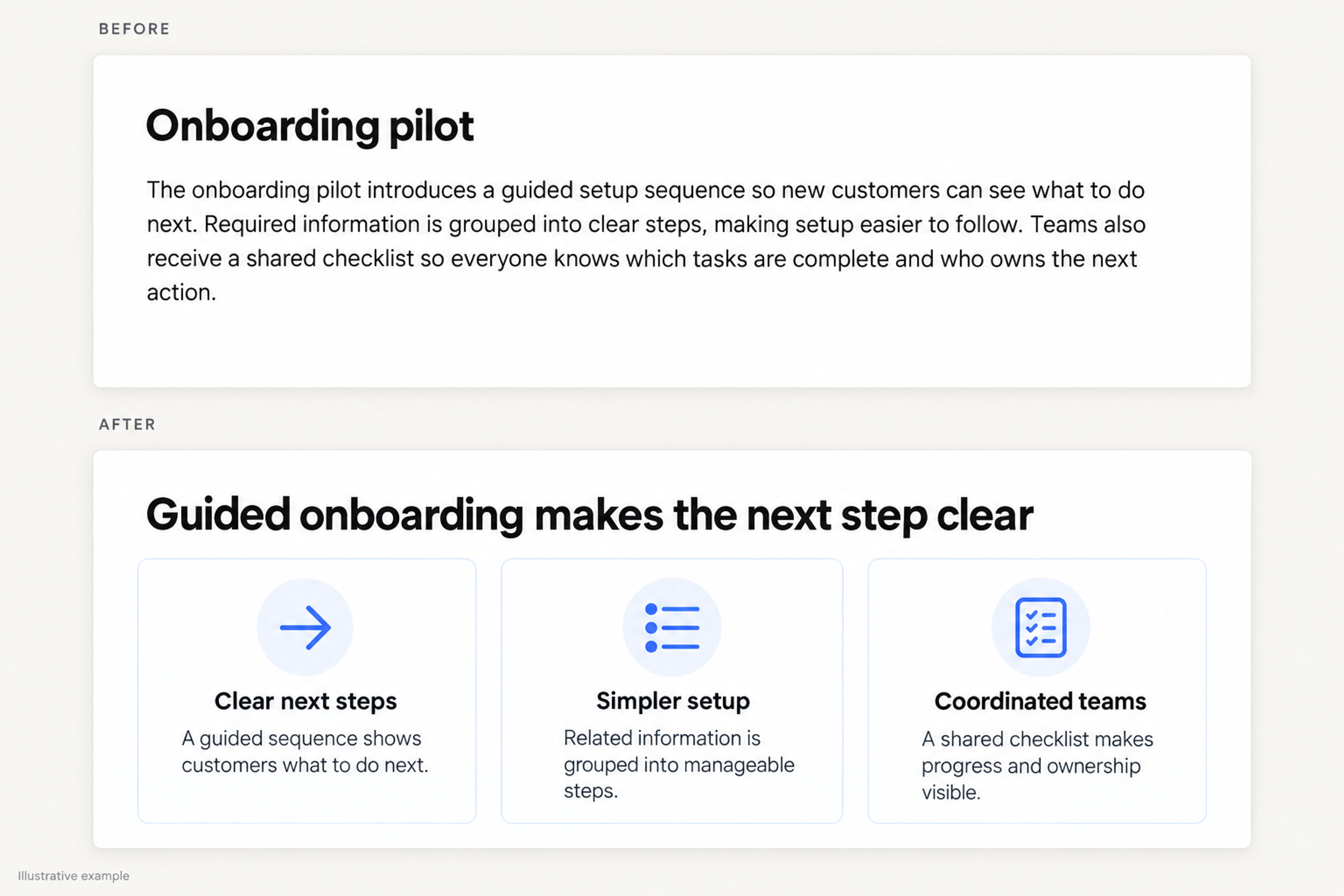
At this point, the deck has a repeatable system: a clear message, a suitable layout, a palette, readable text, and deliberate spacing. Use those choices as the foundation for the rest of the slides.
Turn your topic or outline into an editable deck with coordinated layouts, fonts, and colors.
Create My PresentationLook for a relationship hidden inside a paragraph. Does it describe steps, a comparison, a hierarchy, or cause and effect? Build a layout around that relationship.
For example, the fictional onboarding process could be written as a long paragraph about creating an account, completing setup, and inviting teammates. Turn it into three labelled stages:
Build three simple boxes with Insert → Shape, add a brief label to each, and use connectors only where they clarify the sequence. Keep explanatory sentences short enough to read at presentation size.
Use a visual because it reveals the structure of the idea. A row of unrelated icons beside the original paragraph still leaves the audience with the same reading task.
For our fictional pilot, suppose average onboarding time fell from eight days to five. Show two bars labelled “Before pilot” and “Pilot,” with the values directly visible. Title the slide “The pilot cut onboarding time by three days.” Label the figures as illustrative if you use this example in a practice deck.
Make the chart large enough to carry the slide. Use a neutral color for the baseline and the deck's accent for the pilot. Keep the unit visible and start a bar chart's value axis at zero so the bar lengths communicate the comparison faithfully.
Avoid surrounding this chart with every other project metric. A short note about what changed belongs beside it; unrelated measures belong on another slide. Real presentations should identify the data source and reporting period in a readable note.
A photo should have a clear subject and a defined place in the layout. If the relevant detail occupies a small corner, crop out the surrounding material instead of making the entire image smaller.
Select the image and use the Crop image control. Adjust the crop handles to frame the subject, then finish the crop. For a pair of images, give both frames the same dimensions and align their edges. Keep the subject's proportions natural.
For a product walkthrough, use an image that shows the exact feature under discussion. For a concept slide, choose a photo that supports the idea rather than a generic office scene. Keep text beside a busy image; a plain text area will be easier to read than lettering across detailed photography.
Consistency does not require every slide to have the same arrangement. It means recurring slide types follow the same rules.
Use your comparison layout whenever you compare options. Reuse the result layout when you introduce another metric. Keep title positions, label styles, and colors consistent, while changing the composition to suit each slide's message.
For the fictional pilot, a compact deck could follow this sequence:
| Slide | Suggested headline | Visual structure |
|---|---|---|
| Opening | A simpler start for new customers | Title and subtitle |
| Problem | Setup asked customers to do too much at once | Three friction points |
| Change | The pilot introduced a guided sequence | Three-step process |
| Result | The pilot cut onboarding time by three days | Two-bar chart with illustrative data |
| Decision | Extend the pilot to the next customer group | Recommendation, owner, next milestone |
Copy this outline into your own planning notes and replace the example with your material. Each slide advances the story while staying within one design system.
Open the slideshow and view the slides as your audience will. Look for headings that wrap awkwardly, labels that disappear at a distance, and images that compete with the main message.
Then review the slide thumbnails together. A title that jumps position, an unexpected background color, or a dense slide among otherwise spacious layouts will become easier to spot.
Use this final checklist:
If you are still turning rough notes into slides, start with the story and visual structure together. SlidesPilot's AI presentation generator turns a topic, brief, or outline into an editable presentation with a coherent visual direction.
Give it the audience, the decision or lesson, and the points the deck must cover. For this example, a useful prompt is:
Create a five-slide presentation for a team reviewing a fictional onboarding pilot. Cover the problem, a three-step solution, illustrative results, and a next-step recommendation. Use a light background, dark text, one blue accent, and concise takeaway titles. Clearly label invented figures as illustrative.
That gives the draft a specific communication goal. Refine the wording and layouts in SlidesPilot, then use the completed presentation in your delivery workflow. The manual Google Slides fixes above also give you a clear standard for judging the result.
Use a consistent theme, readable text, aligned edges, and a clear hierarchy. Give each slide one message and use charts or diagrams where they explain that message. Start by fixing layout and text density before adding visual effects.
Choose a visual mood, such as minimal, editorial, or playful, and carry it through the colors, fonts, and image treatment. A restrained palette and recurring layouts make the style feel intentional. Keep contrast and readability strong, even when the style is decorative.
Edit one representative slide first: rewrite the title as a takeaway, shorten the body, align the objects, and remove decoration that does not help. Apply the same changes to similar slides. This gives you a repeatable pattern instead of a new design decision on every page.
Knowing how to make Google Slides look good comes down to a repeatable habit: clarify the message, choose a layout that expresses it, and refine the details. Start with your most crowded slide and make the takeaway easier to see.
Start with your audience, key points, and visual direction. Create an editable first draft in SlidesPilot.