

How to Make a McKinsey-Style Presentation with AI
A practical, original guide to creating consulting-style presentations with clear logic, action titles, evidence-led exhibits, and an AI-assisted workflow.
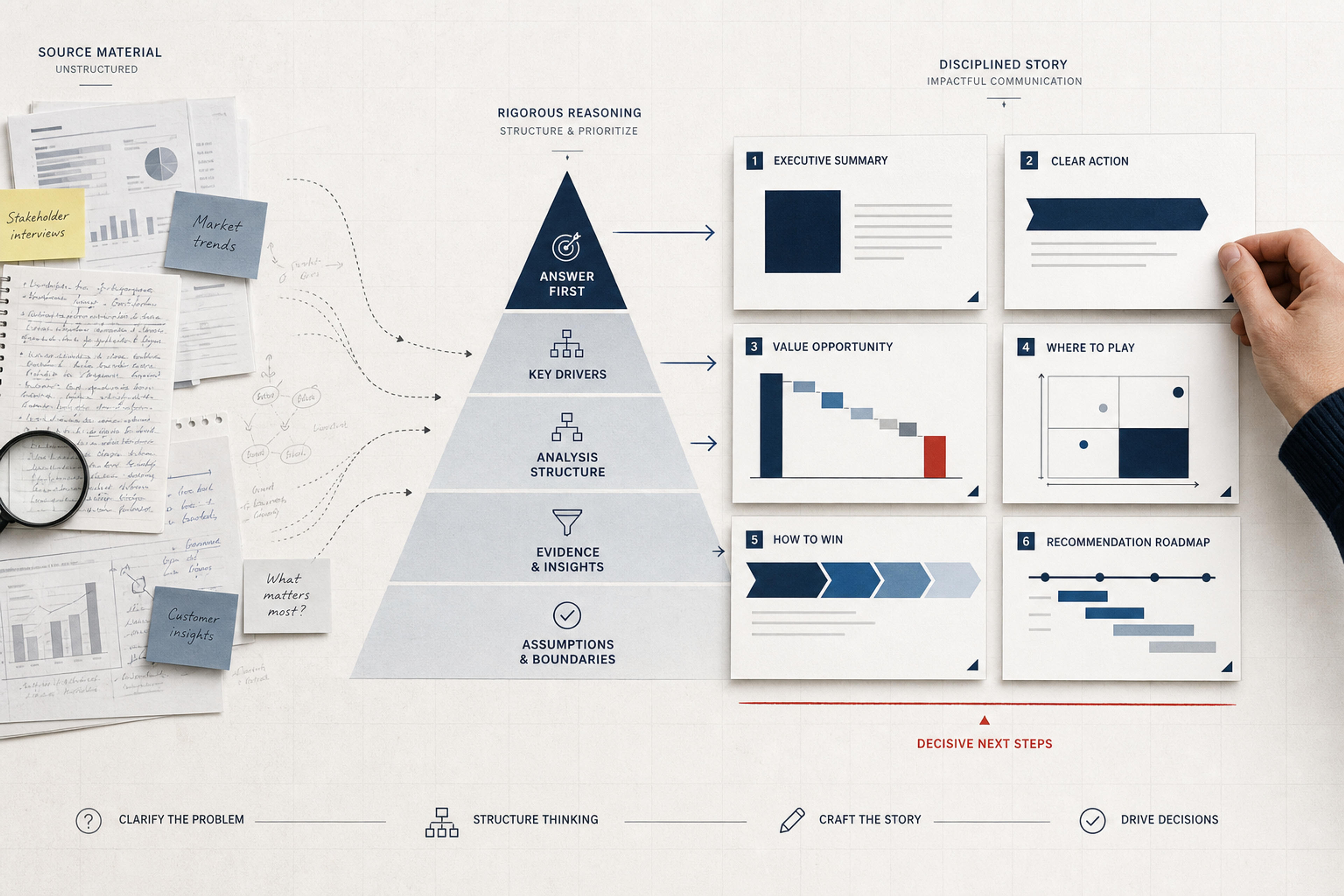
A practical, original guide to creating consulting-style presentations with clear logic, action titles, evidence-led exhibits, and an AI-assisted workflow.
A “McKinsey-style presentation” is not primarily a visual template. It is a way of turning analysis into a decision: lead with the answer, organize supporting ideas into a logical hierarchy, make every slide title state a takeaway, and use evidence that can survive questions.
You can reproduce those principles without copying McKinsey branding, proprietary templates, or confidential client work. In fact, a deck that merely imitates navy title bars and dense charts usually misses the point. The distinctive quality comes from structured thinking before visual formatting.
This guide breaks the approach into a practical workflow you can apply to a strategy recommendation, executive update, market analysis, operating review, or board presentation—and shows where AI can accelerate the work without replacing the judgment that makes a consulting deck useful.
People often use the term to describe several connected practices:
McKinsey itself traces much of this tradition to Barbara Minto, who developed the Pyramid Principle while working at the firm. In McKinsey's account, the principle forces ideas into a clear hierarchy: the point above summarizes the ideas below, and the supporting ideas must belong to the same logical group and appear in a logical order. That is a thinking discipline, not a font choice.
Before collecting slides, write down:
Compare these two briefs:
Create a presentation about expansion into Southeast Asia.
Recommend whether the company should enter two Southeast Asian markets in the next 18 months. Compare market attractiveness, right-to-win, investment, and execution risk; identify the preferred market and the conditions required for entry.
The second brief gives the deck a job. It also defines the analyses that belong and makes irrelevant information easier to remove.
Consulting decks are often built while analysis is still developing. “Answer first” does not mean pretending to know the answer before doing the work. It means maintaining a provisional point of view that can be tested and revised.
Write a draft recommendation:
Enter Market A through a distributor-led model in the premium segment, contingent on securing two anchor partners and keeping first-year fixed investment below the agreed threshold.
Now break the statement into questions:
Those questions form the analytical workplan and, later, the deck structure. If evidence changes the recommendation, update the pyramid and the story. The deck is a record of the reasoning, not a container for defending the first idea.
The Pyramid Principle starts with the governing thought, then groups the reasons that support it, followed by the facts and analyses beneath each reason.
For the market-entry example:
Answer: Enter Market A through a distributor-led premium strategy.
Supporting reasons:
Evidence:
This hierarchy prevents a common failure: mixing facts, findings, and recommendations at the same level. “The market is growing,” “customers value reliability,” and “use a distributor” are not three parallel points. The first two are evidence; the third is a strategic choice derived from a larger set of evidence.
MECE means dividing a set into categories that do not overlap and collectively cover the whole relevant question. It is useful when overlap would cause double counting or when a missing category would invalidate the conclusion.
Examples:
But not every business question has one perfect taxonomy. Real organizations contain overlap, feedback loops, and ambiguity. Use MECE to expose duplication and gaps, then preserve nuance where the decision requires it.
A practical test is:
Turn your brief, findings, and recommendations into a structured, editable consulting presentation with SlidesPilot.
Build My Consulting DeckA rigorous consulting deck works in two directions.
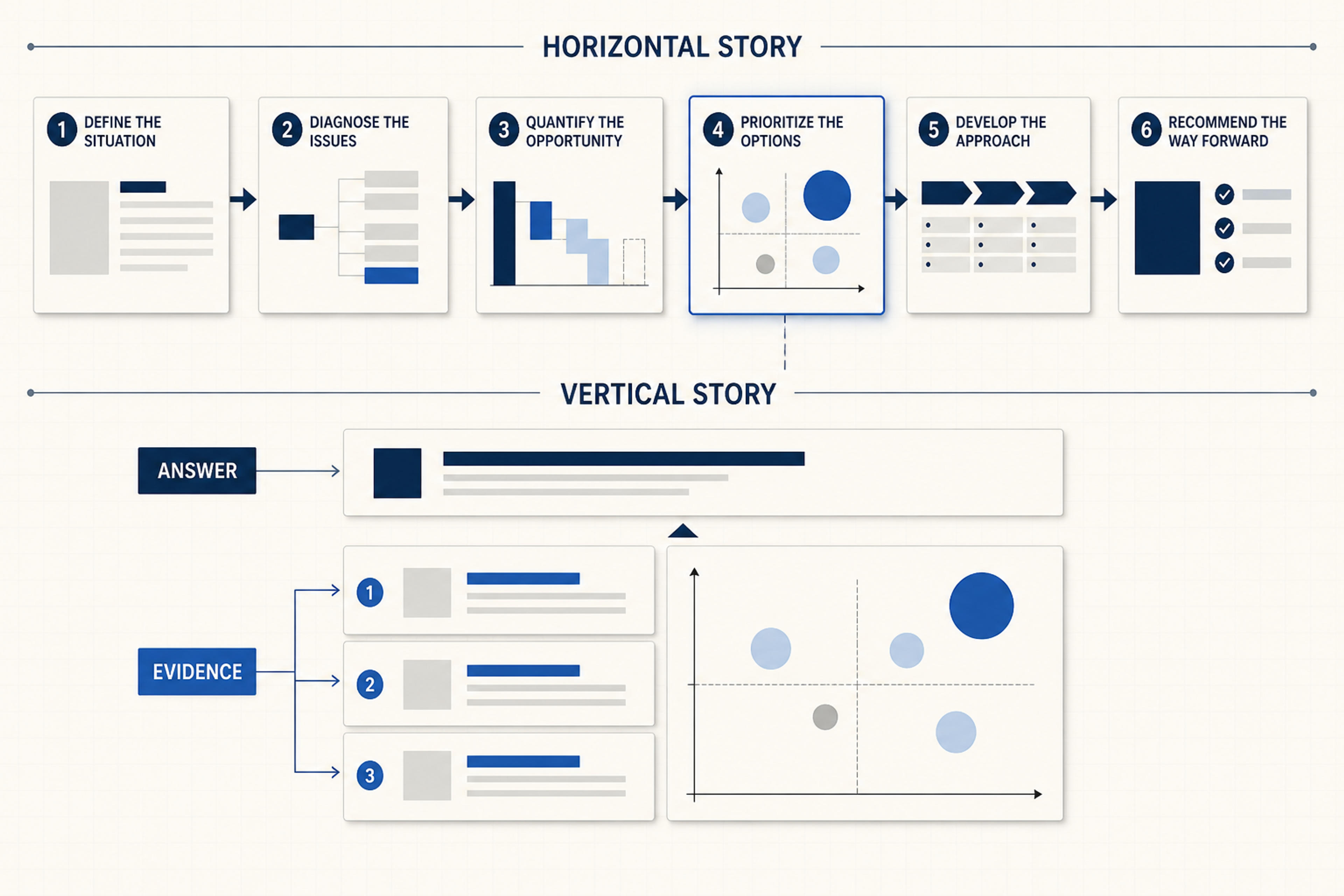
Read only the slide titles in sequence. They should create a coherent narrative:
This is the horizontal story. It lets a senior reader understand the recommendation by scanning the deck.
Within a slide, the title states the takeaway. The exhibit and annotations support that takeaway. The implication connects it to the broader decision.
If a chart shows Market A has the highest growth but the title says “Regional market overview,” the vertical story is weak. The audience must interpret the chart and guess why it matters.
Use this test:
If someone challenged the slide title, would the content on this page be the evidence I would use to defend it?
If not, either the title overstates the exhibit or the exhibit belongs somewhere else.
Topic titles label the subject. Action titles state what the audience should learn.
| Topic title | Action title |
|---|---|
| Market growth | Premium demand will account for most category growth through 2029 |
| Customer research | Reliability—not price—is the leading purchase criterion among target buyers |
| Channel options | A distributor model cuts launch time while preserving access to priority accounts |
| Financial analysis | The base case clears the investment threshold within three years |
| Risks | Partner concentration is the only risk that remains above tolerance after mitigation |
Good action titles are complete, specific, and supported. They do not need to be sensational. Avoid vague verbs such as “exploring,” “reviewing,” or “considering” when the analysis supports a real conclusion.
Draft the titles before polishing the slides. MIT's research-presentation guidance offers a useful parallel: if the titles alone communicate the main story, the deck has a strong narrative backbone.
A consulting slide is not a dashboard that must display everything known about the subject. It is an exhibit built to support one point.
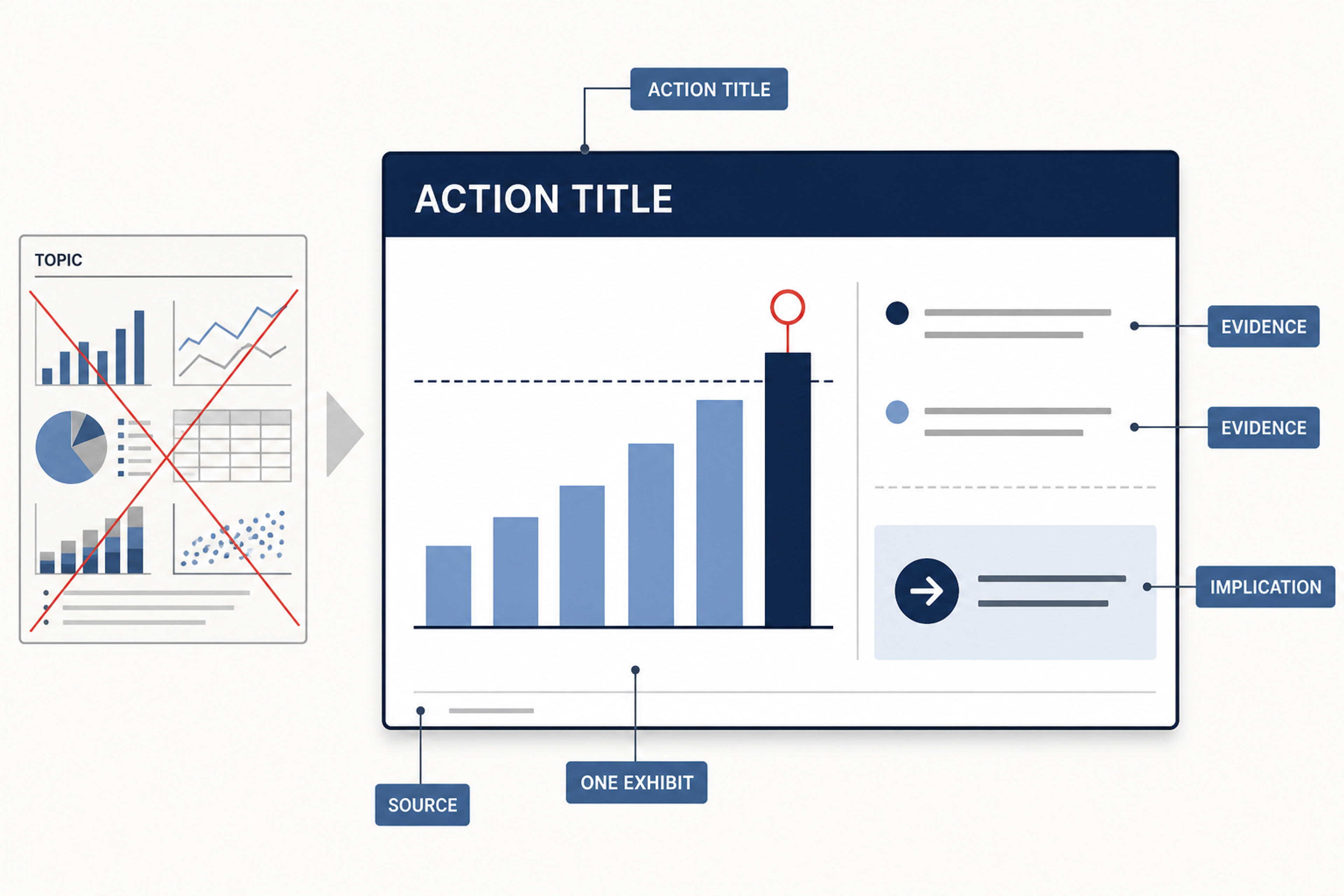
The basic anatomy is:
Remove elements that compete with the takeaway. Multiple small charts can work when they answer one shared question, but six unrelated analyses on one page usually signal that the author has not chosen the conclusion.
Use the visual form that makes the reasoning easiest to inspect:
Do not use a 2×2 merely because it looks consultative. The axes must represent real, distinct dimensions, and the position of each item must be defensible. Similarly, a waterfall should reconcile values; it should not be decorative bars connected by arrows.
An executive summary should be understandable without the rest of the deck. It usually needs:
Write it after the story is stable, even though it appears at the front. Otherwise, it tends to become a collection of early assumptions.
For a live presentation, split the summary across two slides if one page becomes unreadable. For a pre-read, a denser summary can work if hierarchy remains clear. The standard is not “few words at any cost”; it is fast comprehension without losing the decision logic.
One reason consulting decks become dense is that they are asked to serve three different modes:
Decide which mode is primary. A live deck needs larger type, simpler exhibits, and more pacing. A pre-read can contain more annotation and source detail. If the same file must do both, keep the main story readable and use an appendix for depth.
The appendix should not be a graveyard of unused analysis. Organize it around likely questions:
AI is effective at reading source material, clustering evidence, drafting a provisional storyline, and turning structured notes into an editable deck. It is less reliable when asked to “make a McKinsey presentation” with no decision context.
Use this workflow with the SlidesPilot AI presentation generator:
Include the brief, reports, interview notes, market data, financial model outputs, and decision constraints. Remove obsolete versions and label important definitions.
State the audience, decision, provisional answer, success criteria, scope, timeframe, and non-negotiable facts.
Break the decision into the questions that must be answered. Check for overlap, gaps, and mixed logical levels.
For each supporting point, identify the analysis, source, or observation that can support it. Mark hypotheses that still require evidence.
Ask for the slide titles and a one-sentence purpose for each slide before generating the full deck. Edit the horizontal story until it reads as a coherent argument.
Create the deck, then replace generic layouts with the correct exhibits and refine the titles, annotations, sources, and implications.
Challenge every claim: What evidence supports it? What alternative explanation exists? What assumption changes the recommendation? What would a skeptical executive ask first?
A useful prompt is:
Build a 12-slide decision deck for [audience] on whether to [decision]. Use this provisional answer: [answer]. Organize the supporting logic into three or four non-overlapping reasons. Draft action titles that form a complete horizontal story. Use one primary exhibit per slide, state the implication for the decision, keep all source numbers exact, distinguish facts from assumptions, and place detailed methodology and sensitivity analysis in an appendix.
This instruction gives the AI a reasoning contract. “Use a consulting style” gives it only an aesthetic reference.
Read these slide titles as a standalone argument. Identify jumps in logic, repeated points, unsupported conclusions, and missing decisions. Rewrite the titles so the recommendation and supporting reasons are clear without opening the slides.
Review this issue tree. Flag categories that overlap, items at inconsistent logical levels, and plausible factors that are missing. Propose a cleaner grouping, but preserve real-world overlap where forcing separation would distort the decision.
For each slide, state the analytical question, takeaway, evidence required, best exhibit type, and implication. Do not recommend a chart unless the available data can support it.
Good formatting makes logic easier to inspect. Use it consistently:
Microsoft recommends keeping text concise, using readable type, maintaining high contrast, and checking charts for understandable labels. Those basics align naturally with consulting communication: the design should direct attention to the argument, not compete with it.
A dense white slide with a navy heading is not a consulting deck. Build the decision structure first.
“Market,” “Customers,” “Competition,” and “Recommendations” are categories, not a story. State what each section proves.
This produces generic topic labels. Draft the claim, then choose or design the evidence needed to support it.
Use MECE where it improves completeness and prevents double counting. Do not erase important interactions simply to make the diagram tidy.
Label assumptions and scenarios. A projected outcome is not a historical fact; a management choice is not an analytical finding.
The summary should carry the decision, not reproduce every slide. Prioritize recommendation, reasons, impact, risks, and actions.
AI can make uncertain analysis look polished. Keep definitions, numbers, sources, confidence, and assumptions visible.
Before sharing the presentation, ask:
This guide does not use or reproduce a proprietary McKinsey template. The transferable value is the communication discipline: answer first, structured logic, action titles, evidence-led exhibits, and clear implications. Build an original visual system that fits your organization.
It organizes communication as a hierarchy: a governing thought supported by logically grouped reasons, which are in turn supported by evidence. The point above should summarize the ideas below it.
Mutually exclusive, collectively exhaustive. A MECE grouping minimizes overlap and covers the relevant whole. It is useful for issue trees, decomposition, and avoiding double counting, but should be applied with judgment.
As long as the decision requires and no longer. A short executive recommendation may need 6–10 core slides; a strategy readout may need 15–30 plus an appendix. Separate live presentation content from pre-read detail instead of shrinking everything onto fewer pages.
AI can organize source material, draft an issue tree and storyline, and generate an editable deck. The author must still define the decision, test the logic, validate evidence, choose the correct exhibits, and own the recommendation.
The fastest way to make a deck look more “consulting-like” is not to add more charts. It is to make the answer explicit, remove analysis that does not affect the decision, and ensure every page proves one meaningful point. Once the logic is sound, disciplined titles, exhibits, spacing, and sources make that logic visible.
Turn an idea into a complete, structured presentation. Define the audience and goal, guide the tone and length, and let SlidesPilot build the storyline, slide plan, content, and visual direction.
Turn Word documents into clear, structured, editable PowerPoint presentations with AI.
Turn reports, papers, and documents into clear, structured, editable PowerPoint presentations with AI.
Practical guides for turning documents, ideas, research, and web content into better presentations with AI.
Use SlidesPilot to organize your answer, supporting arguments, and evidence into a clear consulting presentation built for executive decisions.

